A design system is what it does
The US Web Design System is about to get a radical overhaul. We don't know yet what that overhaul is going to entail, but I think there's a decent chance that it's going to involve a move to shadcn/ui from vanilla HTML/CSS/JS.
I think that for a couple of reasons. First, while I was still on the USWDS team, shadcn was the rumored choice for its replacement in the early days after the National Design Studio was created. I never heard this from any of them, because they never talked to us directly, but it's what I heard through the grapevine. Also, the AI-ification of USWDS is well underway, and shadcn is a popular choice of the vibecoding crowd.
Maybe it will be shadcn and maybe it won't. But assuming for the sake of argument that USWDS is about to be replaced by a shadcn theme, I want to examine: what would change? What kinds of sites and services would it facilitate and which would it discourage?
I think shadcn is a bad fit for most government websites for a lot of reasons, but for the purposes of this post, I want to look at the question from a pure design system perspective, and through the lens of one component: a prose or typography component.
Defaults as destiny
USWDS was created primarily for government sites composed of text and forms. This makes sense because government sites are mostly text and forms!
Defaults are a good place to start if you want to know what a system was designed to do, so let's look at the typography on shadcn's "Typeset" page with the default settings:
It's clean, and it has a pretty clear hierarchy. The main body text is pretty small, though. If i pick a line that looks like it's about the full width of the column, in USWDS that's about 68 characters (which makes sense given the 68ex max-inline-size). In shadcn, it's 83 characters. That's a pretty big difference! But what kind of difference does it make?
More characters per line makes the information more dense and less scannable. It's also harder to read for lower vision users. Right away, those are two big distinctions between USWDS and shadcn in what they're supposed to do and whom they're supposed to be for.
Obviously you can make big text using shadcn and you can make small text with USWDS, but those are intentional changes you have to make. What I'm interested in here is what the ergonomics of each system drives you towards: what kinds of experiences you design and what kinds of users you center. What I'm proposing is that if you choose shadcn, it's because you aren't intending to build sites that primarily deliver information. Without putting too fine a point on it, that would be a pretty big change in what most .gov sites do, and so it seems like the kind of change one oughtn't to make without following the implications all the way through.
I mentioned that moving from traditional USWDS to something based on shadcn would signal a change in what government websites are for but it's also a change in who they're for. I'm not going to go super deep on accessibility here, but it's worth taking a beat to highlight that small text with more characters per line assumes (at least) a few things about the user reading that text. It assumes:
- Their eyes are able to read that small type without too much difficulty;
- They are able to keep more information per line in working memory; and
- They have the time to scan a page with higher information density to find the information they need.
If you're building an app startup, maybe you know these things to be true of your users. I can tell you they are not uniformly true of everyone who needs to get information from government websites. Choosing something like shadcn would shove many government website users to the margins.
Documentation
The foregoing was mostly about how design systems impact end users, but design systems aren't just components and code: they're also patterns and guidance, and one very clear way a design system can tell you what it does and for whom is its documentation. With that in mind, compare how USWDS and shadcn document how to format text content.
Take a look at the documentation for USWDS's usa-prose component. It has basic info like:
usa-proseis meant for blocks of text where it’s more difficult to add custom classes to individual elements, like a blog post where the content is coming out of markdown or a CMS.
I'll grant you that this isn't rocket science, but it doesn't need to be. What having this guidance shows is that the creators of the component considered this use case and created an affordance for it. shadcn has something like this too, which we'll look at in a second, but the prose documentation also includes a kitchen sink example of what it does, complete with an illustration of the spacing and vertical rhythm of text in the component:
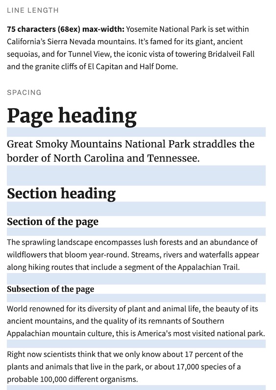
It shows multiple levels of headings, intro text, body text, sections and subsections, and then different types of lists and tables. Putting the effort into designing each level of hierarchy shows that the component creator thought about use cases where each of these levels would be necessary. But maybe even more importantly, putting this illustration front and center in the documentation shows the component consumer (whether they're a designer or developer) how and why to use it. It shows them: use this component to make information easier for your end users to access.
USWDS's typography documentation also gives you a lot of good advice about all kinds of typographic choices, like which typeface to use for what, good font sizes, how much whitespace you should have, among lots of other dimensions of customization. Importantly though, it's not just advice regarding what choices you can make. It's also a kind of argument for why the default usa-prose styles are the way they are. They explain the typography principles behind the defaults and why usa-prose "just works." It's not really framed that way, but it is that. When you read that page, you learn more than how to change the defaults. You learn why you probably shouldn't.
The closest analogue to usa-prose in shadcn is its typeset component. The documentation tells you a lot about how to configure typeset (including, it has to be said, how to make the text bigger for accessibility purposes, but why not make the default more accessible?). It seems to be really flexible, and the documentation does a good job of telling you what knobs there are and how to tweak them. But it doesn't really tell you why you might choose one setting over another.
It also doesn't give you a great kitchen sink example like USWDS does. For as close as I can find to an apples-to-apples comparison, look at the defaults in shadcn's typography configurator:
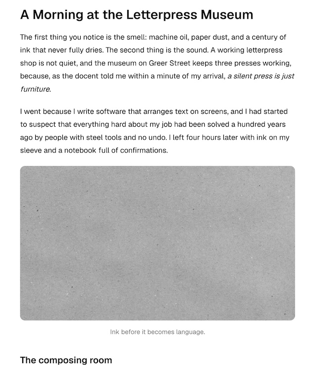
This also has headings and a few different examples of hierarchy. But it doesn't really tell you what you're looking at. It also doesn't tell you what reasonable values for any of these configurable values should be. Or what principles underlie the defaults.
shadcn's typeset component seems really flexible, and its documentation does a really good job of telling devs how to tweak it to make it exactly what they need. But none of the examples the docs provide are especially good examples of richly structured content-heavy pages that are easy to scan or easy to read for a long time. It gives you all the tools to make those things if you want, but it doesn't tell you why you should and it doesn't make any of them the default.
Again, this all might be fine if you're building the next big SaaS app, but it's not geared toward making government websites without a lot of tweaking.
Conclusion
"The purpose of a system is what it does" is an old saw but it's one that has earned its staying power. It also applies really well to design systems. USWDS was built to do the things government websites do, like make information easy to access and understand, and it does them really well. It also does them out of the box with no tweaking required, and with clear explanations of the underlying principles of why it does the things it does. This is all incredibly important for teams who build government websites. Most of the people building the long tail of government sites will stick with the defaults because they don't have the expertise or time to change them. This isn't a dig! They have whole-ass other jobs that aren't being a web designer or developer. The fact that they can just drag and drop USWDS onto their site and know it will just work is critical. And if they need to justify that choice to themselves or their stakeholders, the docs have a clear explanation of why it's the right one.
shadcn is powerful and customizable, but its defaults don't really align with one of the most important things government websites do, which is clearly present information. And getting it into alignment with that use case requires technical and design skill that doesn't exist on most government teams without dedicated resources for it.
shadcn's defaults just aren't compatible with what most government sites do, and they're not compatible with who most government employees are. Moving to something like shadcn would mean a drastic change in what government is and does. I'd suggest it would be a change for the worse.
Originally written on