The US Web Design System is about to get a radical overhaul. We don't know yet what that overhaul is going to entail, but I think there's a decent chance that it's going to involve a move to shadcn/ui from vanilla HTML/CSS/JS.
I think that for a couple of reasons. First, while I was still on the USWDS team, shadcn was the rumored choice for its replacement in the early days after the National Design Studio was created. I never heard this from any of them, because they never talked to us directly, but it's what I heard through the grapevine. Also, the AI-ification of USWDS is well underway, and shadcn is a popular choice of the vibecoding crowd.
Maybe it will be shadcn and maybe it won't. But assuming for the sake of argument that USWDS is about to be replaced by a shadcn theme, I want to examine: what would change? What kinds of sites and services would it facilitate and which would it discourage?
I think shadcn is a bad fit for most government websites for a lot of reasons, but for the purposes of this post, I want to look at the question from a pure design system perspective, and through the lens of one component: a prose or typography component.
Defaults as destiny
USWDS was created primarily for government sites composed of text and forms. This makes sense because government sites are mostly text and forms!
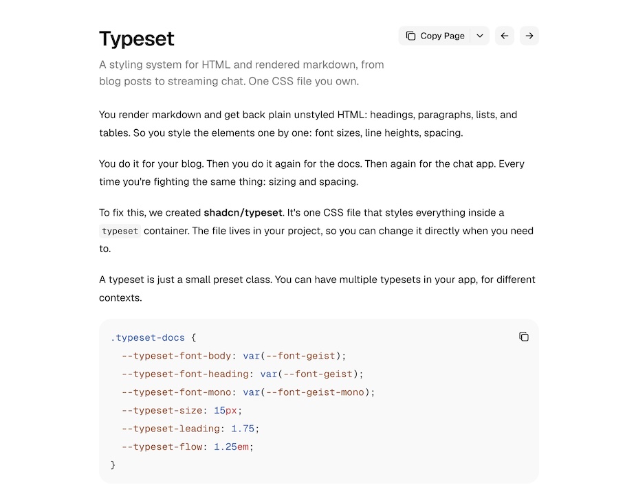
Defaults are a good place to start if you want to know what a system was designed to do, so let's look at the typography on shadcn's "Typeset" page with the default settings:
It's clean, and it has a pretty clear hierarchy. The main body text is pretty small, though. If i pick a line that looks like it's about the full width of the column, in USWDS that's about 68 characters (which makes sense given the 68ex max-inline-size). In shadcn, it's 83 characters. That's a pretty big difference! But what kind of difference does it make?
More characters per line makes the information more dense and less scannable. It's also harder to read for lower vision users. Right away, those are two big distinctions between USWDS and shadcn in what they're supposed to do and whom they're supposed to be for.
Obviously you can make big text using shadcn and you can make small text with USWDS, but those are intentional changes you have to make. What I'm interested in here is what the ergonomics of each system drives you towards: what kinds of experiences you design and what kinds of users you center. What I'm proposing is that if you choose shadcn, it's because you aren't intending to build sites that primarily deliver information. Without putting too fine a point on it, that would be a pretty big change in what most .gov sites do, and so it seems like the kind of change one oughtn't to make without following the implications all the way through.
I mentioned that moving from traditional USWDS to something based on shadcn would signal a change in what government websites are for but it's also a change in who they're for. I'm not going to go super deep on accessibility here, but it's worth taking a beat to highlight that small text with more characters per line assumes (at least) a few things about the user reading that text. It assumes:
Their eyes are able to read that small type without too much difficulty;
They are able to keep more information per line in working memory; and
They have the time to scan a page with higher information density to find the information they need.
If you're building an app startup, maybe you know these things to be true of your users. I can tell you they are not uniformly true of everyone who needs to get information from government websites. Choosing something like shadcn would shove many government website users to the margins.
Documentation
The foregoing was mostly about how design systems impact end users, but design systems aren't just components and code: they're also patterns and guidance, and one very clear way a design system can tell you what it does and for whom is its documentation. With that in mind, compare how USWDS and shadcn document how to format text content.
Take a look at the documentation for USWDS's usa-prose component. It has basic info like:
usa-prose is meant for blocks of text where it’s more difficult to add custom classes to individual elements, like a blog post where the content is coming out of markdown or a CMS.
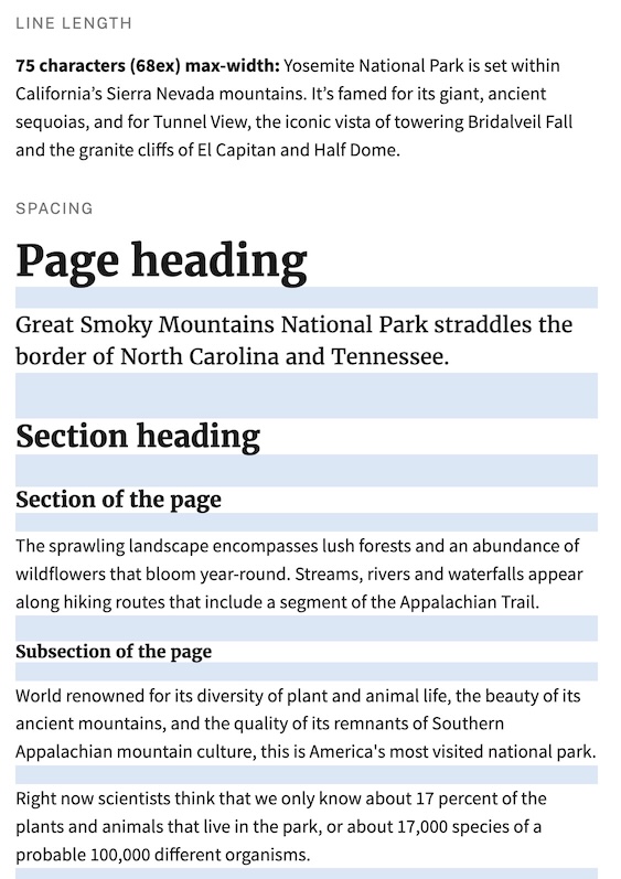
I'll grant you that this isn't rocket science, but it doesn't need to be. What having this guidance shows is that the creators of the component considered this use case and created an affordance for it. shadcn has something like this too, which we'll look at in a second, but the prose documentation also includes a kitchen sink example of what it does, complete with an illustration of the spacing and vertical rhythm of text in the component:
It shows multiple levels of headings, intro text, body text, sections and subsections, and then different types of lists and tables. Putting the effort into designing each level of hierarchy shows that the component creator thought about use cases where each of these levels would be necessary. But maybe even more importantly, putting this illustration front and center in the documentation shows the component consumer (whether they're a designer or developer) how and why to use it. It shows them: use this component to make information easier for your end users to access.
USWDS's typography documentation also gives you a lot of good advice about all kinds of typographic choices, like which typeface to use for what, good font sizes, how much whitespace you should have, among lots of other dimensions of customization. Importantly though, it's not just advice regarding what choices you can make. It's also a kind of argument for why the default usa-prose styles are the way they are. They explain the typography principles behind the defaults and why usa-prose "just works." It's not really framed that way, but it is that. When you read that page, you learn more than how to change the defaults. You learn why you probably shouldn't.
The closest analogue to usa-prose in shadcn is its typeset component. The documentation tells you a lot about how to configure typeset (including, it has to be said, how to make the text bigger for accessibility purposes, but why not make the default more accessible?). It seems to be really flexible, and the documentation does a good job of telling you what knobs there are and how to tweak them. But it doesn't really tell you why you might choose one setting over another.
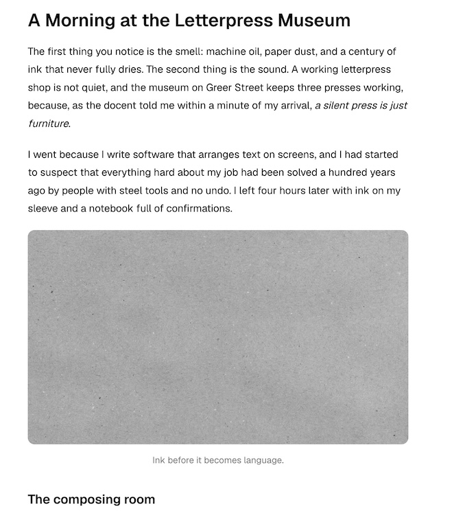
It also doesn't give you a great kitchen sink example like USWDS does. For as close as I can find to an apples-to-apples comparison, look at the defaults in shadcn's typography configurator:
This also has headings and a few different examples of hierarchy. But it doesn't really tell you what you're looking at. It also doesn't tell you what reasonable values for any of these configurable values should be. Or what principles underlie the defaults.
shadcn's typeset component seems really flexible, and its documentation does a really good job of telling devs how to tweak it to make it exactly what they need. But none of the examples the docs provide are especially good examples of richly structured content-heavy pages that are easy to scan or easy to read for a long time. It gives you all the tools to make those things if you want, but it doesn't tell you why you should and it doesn't make any of them the default.
Again, this all might be fine if you're building the next big SaaS app, but it's not geared toward making government websites without a lot of tweaking.
Conclusion
"The purpose of a system is what it does" is an old saw but it's one that has earned its staying power. It also applies really well to design systems. USWDS was built to do the things government websites do, like make information easy to access and understand, and it does them really well. It also does them out of the box with no tweaking required, and with clear explanations of the underlying principles of why it does the things it does. This is all incredibly important for teams who build government websites. Most of the people building the long tail of government sites will stick with the defaults because they don't have the expertise or time to change them. This isn't a dig! They have whole-ass other jobs that aren't being a web designer or developer. The fact that they can just drag and drop USWDS onto their site and know it will just work is critical. And if they need to justify that choice to themselves or their stakeholders, the docs have a clear explanation of why it's the right one.
shadcn is powerful and customizable, but its defaults don't really align with one of the most important things government websites do, which is clearly present information. And getting it into alignment with that use case requires technical and design skill that doesn't exist on most government teams without dedicated resources for it.
shadcn's defaults just aren't compatible with what most government sites do, and they're not compatible with who most government employees are. Moving to something like shadcn would mean a drastic change in what government is and does. I'd suggest it would be a change for the worse.
tl;dr: the US Web Design System has been functionally taken over by DOGE or a DOGE-aligned group. Its code and community are now being run by AI, and its current form does not deserve the hard-earned trust USWDS built over its first 10 years. Efforts are underway to preserve the pre-AI state, and hopefully to continue development of this critical digital public infrastructure.
This week, the last remaining member of the USWDS team was forced out of their role, and a new AI engineer replaced them. Since then, that person, armed with a cadre of AI tools, quickly undertook to reshape the entire system.
This is a rapidly developing situation, and my thoughts aren't as organized as I'd like (though putting them here is, in part, a way to fix that). I apologize up front if any of this isn't fully baked. But what follows is a recap of how we got here, my assessment of the current state of things, and finally a brief look ahead.
A short history of how we got here
Here's a quick(-ish) rundown of the recent history of USWDS as I experienced it. I'm speaking for myself here and any errors or omissions are due to my own addled brain.
During the presidential transition in January 2025, a broad communications moratorium was imposed. That meant that the USWDS team was unable to say much (or anything, really) about the changes to come. However, work continued more-or-less as usual, albeit with increasingly bad vibes and fraying nerves.
Shortly after that (late February/early March), GSA ended its contract with the vendor that provided most of the staff for the USWDS team. These were the people who did most of the day-to-day work building and maintaining USWDS, as well as supporting the community of users. USWDS went from a team of about 12 to a team of four, all of whom were feds. Within a month, the fed team was down to two: our design lead who then became product lead, and me.
Obviously these drastic changes to the team composition necessitated drastic changes to the product roadmap. At that point, we effectively abandoned the big plans we had at the end of 2024, and shifted to a maintenance mode, where we mostly just kept the lights on. (We did ship a release in that time, including USWDS's first web component, designed to coincide with the rollout of the Federal Website Standards, but that's another story for another blog post.)
Around this time, Technology Transformation Service, the part of GSA that houses USWDS, was about to undergo a reorganization. The rumor was that the reorg would put USWDS closer to Cloud.gov. We were excited about the possibility of better support, and started collaborating with our Cloud colleagues on an informal basis. In light of the anticipated changes, the USWDS team switched gears again to start reimagining how USWDS could integrate with Cloud. It was actually exciting, and it was the first time since the carnage at the start of the year that it seemed like USWDS had a path forward.
That hope proved illusory. The reorg didn't happen as planned, and despite my being engineering lead for USWDS, I was detailed to a DOGE project in an entirely separate part of GSA. Then the shutdown happened, during which I was furloughed for a while before being reclassified as essential and brought back. The product lead remained furloughed for the duration of the shutdown.
In November of 2025, I left GSA shortly after returning from furlough, so from then on I can't say first-hand what was going on inside TTS. But USWDS did get some limited engineering support, and was even given some unofficial indication that NDS was going to leave the project alone. By Spring of this year, USWDS created clearer pathways for open source community contributions (I got to be the first non-fed maintainer, which meant a lot to me). Things looked like they were stabilizing as well as they could under the circumstances.
Then in August, USWDS's product lead and only full-time team member (Fed or otherwise) was placed on administrative leave by TTS's new director, Sam Corcos. A couple weeks later, all of the open source contributors and maintainers were booted out of the repo, the product lead was "officially" ousted (fired by diff), corcos installed Ryan Parker as USWDS Lead.
USWDS enters its slop era
It wasn't immediately clear what Corcos and Parker intended to do with USWDS. My assumption was that they'd simply replace it with a shadcn theme, as that had been the rumored approach in the early NDS days. Instead, Parker threw AI at every corner of the project. It started small with a pull request to add automated PR reviews, but then took off at AI scale. Some highlights of the AI takeover of USWDS:
The project discussion board has been flooded with AI-generated posts. This includes new posts, as well as AI-generated responses to old posts.
Old PRs and issues were closed en masse with pro forma legalistic AI-generated responses.
Many new PRs, including several with breaking changes, appeared at a rapid non-human-reviewable pace.
Machine-generated architectural decision records were being created (some based on my own half-baked germs of ideas I'd left on the project board). Presumably these ADRs, once approved (approved by whom? Ryan? Sam? CodeRabbit? Claude?), would then be fed back into AI to generate the implementation and complete the machine ouroubouros.
Because these changes all took place over the course of about 24 hours, and are continuing at the same breakneck pace, it's been challenging to follow along with them. But having mentioned just a few of them, a few trends are already emerging:
AI is making changes faster than humans can meaningfully track. USWDS has always moved slowly, even to the point where it could fairly be criticized for it. But faster doesn't necessarily mean better. New features need to be thoroughly tested before they're rolled out to unsuspecting (and risk-averse) .gov sites. If a change could have accessibility implications, it needs to be vetted by expert testing, and ideally validated with real assistive technology users. Obviously none of that is happening when a bot submits two dozen PRs overnight.
AI is crowding out real human community discussion. When every open PR, issue, or discussion thread gets updated at once, it makes it impossible to follow for anyone inclined to do so. If someone is inclined to try, they'll be rewarded with walls of brain-numbing machine prose.
Relying on AI to direct and implement the work shifts the risk and responsibility of testing onto the community of human users. For just one example, look at this comment (emphasis mine):
Before selecting an implementation, we should establish the user need and how definitions would be discoverable and operable with keyboard, touch, zoom, and screen readers. Please share examples or findings here, including cases where an inline definition works better than a glossary page. No tooltip design or delivery date has been selected, and closing the parallel issue does not mean the need is resolved.
While USWDS has always benefited from the user community submitting use cases for particular components or other changes to the system, the team was ultimately responsible for testing and creating "findings." Even in a world where AI is used in conducting user research, AI doesn't itself conduct user research. A comment like this shows that nu-SWDS (if I can coin that), like so many other AI-first projects, has to be built on top of of human work (willingly or not). With just one human on the team, it's up to you now to do the work to make sure a change is good or functional or accessible. If you're on a small federal team, probably made even smaller in the DOGE era, you can't do that even if you could've before. This is worse than useless.
Humans are not in the loop.This PR, adding a machine-written ADR, presumably to be implemented by a machine as well, came from this germ of an idea I created an issue stub for last year. The PR is closed now, but for a couple of hours until the bots did a bit of a rethink, it appeared the AI was going to one-shot a product decision for itself based on one random sentence I tossed off with no further support. I just happened to see this one because of my involvement with it, but what other examples are in there where the PR machine continues to go brrrrr?
There are more examples, and I'm sure more big picture takeaways here, but I believe this gives a sense of how quickly things have deteriorated.
So now what?
No one should use nu-SWDS. Or at least, if you choose to use it, you should understand that it is no longer the project it used to be, and you will not have the same assurance of accessibility or usability that you used to have. It won't have been tested with real users, and it won't have been battle-tested on thousands of .gov sites. If I can repurpose a line I used on bluesky, it's the private equity husk of USWDS.
If you want to continue using USWDS, the pre-slop code is all available on Codeberg (npm release TK). An archived version of the documentation site is up on the 18f.org domain.
A group of USWDS users, civic technologists, and fellow travelers are working on standing up an organization to ensure this critical infrastructure remains available. That effort is very much a work in progress, so I won't say more about it at this time, but stay tuned.
Welcome to fight night. In one corner, we have list semantics. In the other, we have headings. Only one can survive.
Ok maybe that's overly dramatic, but I wanted to get your attention before embarking on a deep-ish dive into accessibility APIs and the specs that they implement.
The problem
I'm working on a new accordion component, based on the US Web Design System's implementation. Some key design details that make USWDS's component work the way it does:
The interactive, focusable parts of the component that are always visible, and that control the open/close behavior of the accordion sections, are headings that contain buttons. The buttons are critical because they drive the interactivity. The headings are important because they provide the main structure for the component in the accessibility tree.
It uses JavaScript to actually control the open/close behavior. This creates a couple of constraints on the use of the component. For one thing, obviously it means that it won't work without JavaScript. Depending on how it's set up, this means that content might not be available when JavaScript isn't. Obviously that's not a dealbreaker for a lot of teams and products (if the content is critical, it probably shouldn't be stuffed inside an accordion in the first place), but it's something to consider. It also means that there needs to be some ARIA to give the browser some hints about what bits of the component are associated with each other, and that helps drive the interactivity. Again, this shouldn't be a dealbreaker for most teams, most of the time, but it does add some complexity that component consumers have to navigate, and it's a potential source of breakage.
The implementation I'm working on is visually similar to USWDS's, but with a couple of key differences under the hood. The main one is that it doesn't require JavaScript to function. The <ogds-accordion> wraps one or more <details> and <summary> elements, and the open/close functionality comes from the details, so the browser handles that whether or not JavaScript runs. The JS is mainly used for progressive enhancement, and only affects the presentation of the component (visually, but also for assistive technology users, as we're about to see).
A comment on the issue that describes the need for this component suggested that it might be useful to implement list semantics on it. This makes sense. The accordion groups related content, and it's not unreasonable to imagine that exposing that relationship to accessibility APIs would give assistive technology users a way to leverage that relationship.
Unfortunately, this is where things get difficult. My implementation lets the component consumer add a heading-level=<Number> attribute to the component to add heading semantics to each summary element, and to set the right numerical level for the page's content hierarchy. This makes it easy to match the heading semantics of the USWDS implementation while keeping the markup simple. In order to get the list semantics, I also implemented a use-list-semantics attribute that adds a role="list" to the accordion container and role=listitem to its direct children (each details element). The problem is what happens when both are enabled.
With a list, whether it's a plain HTML ul or ol, or as here, a collection with list semantics added via ARIA, a screen reader will announce that it has encountered a list with the number of items. As the user traverses the list, the screen reader should announce the current position in the list (i.e. "4 of 5 items"). Screen readers also provide additional ways for users to find lists and navigate their contents. This turns out to be part of why this is all more complicated than it might appear at first blush.
Similarly, when a screen reader encounters a heading, it will announce it as "heading level X: my useful heading text," or whatever. Part of what headings do for users, whether they're reading the page visually or through assistive technology, is to establish the hierarchy for the content. As with lists, assistive tech also gives users ways to navigate the page through this hierarchy.
The problem occurs when both of these attributes are present on the component. When testing it in Safari + VoiceOver, it will be correctly announced as a list with X items. However, upon entering the list and encountering the first summary element with heading semantics, VoiceOver will stop behaving as if it is in a list. It will announce the headings, but it won't keep track of or announce the current position in the list ("item X of Y").
But why?
The spec
As it turns out, I think there's an issue in the spec that causes this ambiguity. First, is that the relevant spec (Core-AAM) only describes how to calculate which accessibility tree nodes are related to each other, their order, and the current position in the list:
If aria-posinset and aria-setsize are not provided, user agents MUST compute them as follows: ... if the role supports aria-posinset and aria-setsize, process the parent (DOM parent or parent defined by aria-owns), counting items that have the same role. (Emphasis added)
What remains unspecified is what to do when, as here, the items have multiple semantic types with one nested in another (e.g. headings within list items). When a user navigates by heading, should the AT also surface the ancestor list item's position? Which semantic context should take precedence? Can both be conveyed together, or does one simply displace the other? In this case, the heading context clobbers the list position context entirely.
Maybe it's not fair to say that there's an "issue" in the spec, but there is at least a limitation on what the spec, you know, specifies.
My solution
Given that it appears that assistive tech can only present one of these navigation paradigms at once, we can help the AT out by only giving it one paradigm at at time. At the component level, of course we can check that only one of the controlling attributes is present and throw an error if both are there. But the real solution is to document clearly why only one of these paradigms should be used at one time and provide clear guidance on which interaction patterns should leverage headings and which should leverage lists. For example, if the accordion is used to break up a large page into more digestible chunks of content, that's a good use for headings. If there wasn't an accordion, that's what you'd do anyway. You'd use headings.
Conversely, if you have a set of concise FAQs, maybe that's a place where it could make sense to use a listy accordion (yes I know FAQs are an anti-pattern but I also know we have often to build them anyway).
Wrapping up
I think this either/or scenario is probably the way to go, but of course any time you have to rely on documentation to do the heavy lifting of ensuring that people use components as intended, you can only be as clear as possible and hope for the best. There are tooling-related ways to buttress the documentation, but at the end of the day, this is a human-facing problem with human-facing solutions. On the bright side, any day you get to dig into specs at work is a good day, right?
I find it a little grating when people talk about their jobs under the rubric of "personal news." No judgment if you feel differently, but in a perfect world, my personal life would not be meaningfully entwined with my job. That said, this post is all about how my job has affected me as a person this year and I will spoil it at the outset by saying the effect has not been good.
But in order to talk about how and why this year has been such an ordeal (beyond what you've probably already read about from other feds or news reporting about them), I want to back up a little and talk about my time in government more expansively.
A capsule history the last 6 years of federal government digital services
I joined government as a Consulting Engineer with 18F in 2019 during the first Trump administration. During that time, the White House's attitude toward digital service teams working to improve the public's experience of government services was one of generally benign indifference. I've heard stories of inflection points at which that attitude could've changed (more likely than not for the worse), but can't speak to those points with any first-hand knowledge. What I can say is that, except for a few high-profile projects, the White House mostly left us alone to do great, impactful work with our agency partners.
And while I definitely don't think Trump deserves special credit for being the one sitting at the Resolute desk when good laws happen to cross it, he is the one who signed the 21st Century Integrated Digital Experiences Act, and the Modernizing Government Technology Act (which created the Technology Modernization Fund) into law. These are still driving big changes in how feds build technology today. (Though it has to be said, as part of the contested budget driving the current shutdown, Trump's Republican colleagues are trying to zero out the TMF.)
Then President Biden was elected. Given the mostly listless back half of that administration, it's easy to forget how much promise there seemed to be at its outset. Remember when people talked about Biden being a new FDR? For those of us doing digital services work inside government, it's hard to overstate how excited we were. Key positions were filled with political appointees who either came from our milieu or clearly shared its vision and goals. And new sources of funding, like the American Rescue Plan, promised to be an engine driving the growth of new programs and platforms throughout government. The Biden OMB's Delivering a Digital-First Public Experience memo put real force behind implementing 21st Century IDEA.
Looking back now, it's hard not to feel like Biden's one term was a historically blown opportunity for creating the kind of lasting change that would've been hard for subsequent administrations to undo. Part of this is obviously due to the fact that, as we've all learned the extremely hard way, there's not much that the executive can't tear down—irrespective of laws or norms—if the putatively coequal branches can't or won't exercise their constitutional powers as checks and balances to stop it. However, while it's correct and important to point to the critical programs (like Direct File) and offices (18F, real USDS) the second Trump administration destroyed, one also mustn't overlook the unforced errors during the Biden era that prevented teams from moving the ball forward as much as they could have. (This isn't the space to litigate any of that but buy me a beer sometime.) Whatever the cause, it's impossible to deny how much has been lost in the first 10 months of the second Trump administration and how insurmountable the challenge of rebuilding any of it feels to many of the people who want desperately to do that.
2025
It seems hopelessly naïve now, but for those of us who were in government for Trump 1, there was at least a faint hope that things might go the same way this time around—that is, that maybe we'd be able to stay mostly under the radar this time too. Of course any such glimmer of optimism was thoroughly squashed after Trump's second election, and the clear signals that he was going to hand the reins of the administrative state over to Elon Musk and Russell Vought.
I was lucky. As part of a consulting project while I was still at 18F, I spent most of 2024 serving in an acting capacity as Engineering Lead for the US Web Design System. Then in October, just before the election, I was offered the chance to move into that role on a full-time basis. I jumped at the chance, not just because I loved the team and the products (though I emphatically did!), but because it seemed like a safer place to be than 18F in the event that the election went the way that it ultimately did. That bet paid off for me in a way that was even grimmer than I would've thought at the time.
Since January, the experience of being a federal worker has been a cavalcade of swords of Damocles, Chekov's guns, and precariously hung shoes waiting to drop. And unfortunately, just about every ominous sign did in fact portend real danger. At every opportunity, the people running the executive branch made it plain that rank-and-file feds were expendable at best and at worst, deserving of open contempt. There were multiple rounds of "fork in the road" emails from mysterious email addresses sent from insecure servers. Reductions in Force (RIFs), legal and otherwise, hollowed out still more capacity, and left those of us who remained in constant fear of sudden illegal termination.
At the beginning of the year, I was leading a small but amazing team of contract engineers working on USWDS. Shortly after the inauguration, that contract was terminated, so the USWDS team was down to four federal employee practice leads. Very soon after that, two of those dear colleagues left of their own accord. That left a team of two feds to steward the design system supporting hundreds of sites across the government web. The two of us were safe for the time being, but obviously we needed to drastically change our roadmap and the way we planned to go about delivering it. All around us, other similar contracts were being cancelled with little-to-no warning.
In the spring, I got notice that I was subject to RIF. Everyone who was in a position to do so reassured me that I wasn't actually at risk of being let go. I'm an engineer and the DOGE and DOGE-aligned tech bros running my corner of government value engineering over other skillsets. Still, it's not fun to have the legal process for termination hanging over your head.
Another of the administration's tactics to cull the federal workforce is the universal requirement to "return" to office. I use scare quotes because most of us were fully remote since before Covid. I've never reported to an office for regular work as a fed. None of the people I work with day to day work anywhere near me, so my going to an office wouldn't do anything to foster collaboration. The initiative is intended to force people out who can't or won't go to an office, and to discipline and surveil the people who remain.
These threats loomed over many feds, but one that threatened USWDS specifically is the executive order creating the so-called National Design Studio. This EO explicitly mentions USWDS, and we were left to wait to see what its actual impact would be on our team and the product. The early signals were extremely mixed. On one hand, the team got informal hints that we should have a wishlist ready to be able to say what we would need in order for USWDS to implement any directives that would come from the NDS and its director. On the other, we could see the NDS's early work, such as America by Design, The NDS's own website, and TrumpRx. None of these has much, if anything to do with USWDS. They also happen to be bad websites.
If these sites are any indication of what was coming down the pike as the future of government websites, it's a bad sign for the people who have to build and maintain those sites, it's a bad sign for USWDS, and it's a bad sign for you as a user and a member of the public. Prior to the shutdown, the USWDS team still hadn't heard anything about what NDS was supposed to mean for us or for the System. However, without delving into specific rumors, there have been indications that NDS's intentions for USWDS or its possible replacement would not be meaningfully better than the JavaScript-heavy, inaccessible, and AI-generated error-ridden sites than that office's early work would suggest.
Then the shutdown came, and the USWDS team was told not to come to work. This came as a bit of a surprise, since our team is not funded through congressional appropriation. The pot of money my last paycheck came from is still there. I've been through several shutdowns now, but this is my first furlough. The only thing that changed is the administration's choice to weaponize furloughs this time. As it happens, I was actually brought back from furlough, but only to work on a ridiculous website that, while it uses USWDS, is otherwise unrelated. I was also directed to spend no more than 5% of my time on USWDS (my actual job) until this other project is done or gets additional resources.
(Side note: if someone were inclined to look into the demographics of these discretionary furloughs as well as who was called back into work vs. who was left furloughed, the interested observer might find it lines up with other major personnel moves the executive has made this year.)
What's next?
It has been a deeply upsetting and at times traumatic year, but I've weathered it as best I could, and managed to stay employed. In the early part of the year when I expected to be RIF'd along with all of my dear friends and colleagues from 18F, I interviewed to the point of near-burnout. I even had an exciting offer to go work on a state digital services team that, after agonizing over the decision for a week, I ended up turning down to try and stick it out with USWDS and GSA.
However, things are a bit different for me today than they were those handful of months ago. Back then, the NDS threat hadn't yet appeared on the horizon. And I believed then I'd be able to avoid having to report to a random, decrepit building for RTO, which I no longer think is possible. And there's just the simple fact that I've been steeping in the accretion of this misery for that many more months, which has taken an ever-increasing toll. Finally, to put it plainly, the horrors that the federal government has been perpetrating in areas that don't have anything to do with me directly have nonetheless become impossible to shrug off and I don't want to have even a whiff of complicity with them.
So, some personal news: for all those reasons, I resigned. As of today, I'm no longer in federal service.
On the happier side of the ledger, all of those things also lined up with a terrific opportunity to keep working in public service and design systems. I'm going to keep the specifics of that role out of this post, since this is all very dark, and I'd like to keep a little distance between all of this and the new role. But suffice it to say, while I'm mourning my own federal service and the dire state of the republic, I'm incredibly grateful to get to keep doing work that's both personally fulfilling and technically interesting.
Before closing this out, I do want to say how grateful I am for the great years I had as a fed: for all the work I had the opportunity to do, and most importantly for all of the wonderful people I had the life-changing good fortune to work alongside. To everyone still there, thank you for your continued service. You deserve so much better.
It turns out that, at least for the time being, I work on a design system for a living. I also happen to really like working on them, so here I am (on the weekend!) blogging about some web component-based design systems I've come across recently.
generic is a cool idea in that it's a set of (mostly) unstyled components you can pull in and style however you like. And maybe you've heard that web components are hard to style because they use shadow DOM: well good news, friend, because generic's components are mostly light DOM. Where generic does use shadow DOM, it still exposes shadow parts or provides custom properties to make the component styleable (see the generic-radio for an example with both).
What's great about leveraging light DOM so much is that, in addition to being easier to style, it's also more accessible and performant. The more content that goes into light DOM, the less work the custom element JS needs to do, the more content is available immediately, and less depends on JS executing at all. This jargony name for this architecture now is HTML Web Components (although generic predates this coinage by a couple of years), but the basic idea is just that you should leverage semantic HTML for as much of a web component's content and functionality as possible.
Another web component-based design system I've been looking at this week is tyler forge, by Tyler Technologies. It's not unstyled like generic. Its design is based on Material. It's also not shy about using shadow DOM. Different strokes, etc. What I like about it is its modularity. The way it does theming by exposing custom properties and shadow parts is a lot like what I want to do with USWDS. It's also got CSS-only components that are, um, CSS-only. I think the thing that jumped out at me was the mixed Sass/CSS custom props codebase, which is what USWDS is likely to be for a long time. I'm not sure I have anything smart to say about tyler forge, but I wanted to jot down some observations while they're fresh in my mind. extremely Marge Simpson voice I just think it's neat.
One last thing: just going to drop this prototype accordion component here. I've been wanting to make something like this for USWDS (which is why the tag name here is usa-accordion). It's just an accordion made out of details and summary elements, and it's all light DOM, so the basic functionality will always work. The only thing the custom element adds is the exclusive prop which, if set to true, will add a unique name to all of the details child nodes, triggering the browser-native exclusive accordion behavior. Since the unique ID is generated per-component, multiple accordions won't interfere with each other.
My favorite project that I've ever worked on is one from my early days at 18F. It's the one that really helped me get what the work was. I'm going to talk about everything I was lucky enough to work on on this project and some of the things I learned doing it. I'd love it if you took away some lessons about how great projects work, but I'd be lying if I said I didn't hope you'd read it and think about what a shame it is that the group who did this work no longer exists.
I won't name the partner for this project, and I'll leave out some details so as to not identify them. Given everything, I don't really want to call extra attention to 18F's partners, and honestly I don't chase down all of the things I would need to get permission to go into more detail. Besides, the work and methods I'll talk about here would've been employed on so many different projects with so many amazing agency partners.
The background
This agency had a ton of data, going back over a century, scattered across multiple databases, in multiple formats, with multiple schemas. They needed to consolidate these in some way in order to make those data usable. In addition to the data wrangling, they also needed a new frontend to give their users access to those data. Naturally, with all of those data on the backend, and a new frontend in the works, they also needed an API to get data back & forth.
In addition to the technical challenges, this agency served a huge variety of users, including research scientists, internal customers, and members of the public who used the data for recreational purposes. Whatever solutions the agency deployed would need to serve these vastly different users and use cases.
The team
The team from 18F included a backend dev, a strategist, a visual designer/user researcher, and yours truly as the frontend dev. The backend dev and strategist also shared project lead responsibilities. On the partner side, we worked regularly with the product owners as well as two engineers. Since this was one of my first projects at 18F, it was also one of my first experiences working closely with career feds.
One of the first things that made this project such a great experience was having such engaged and empowered product owners on the partner side. They participated in all of our standups and sprint ceremonies. If there was a blocker, they would hear about it immediately and help get unstuck. It also really helped build a sense of shared ownership of and responsibility for the success of the project. I'll talk a lot about secret sauce in this post, but I think if there's one thing that can make or break a consulting project, this is it: having an engaged and empowered product owner work as closely as possible with the team.
The work
Backend
We had a good sample of a few data sources we were going to have to pool together, but not enough to make big conclusions about a schema for the whole system. Basically we had enough to start prototyping with. Our backend dev whipped up a simple Flask app as a first draft REST API. However, given the complexity of the data and the wide variety of queries the API would have to support, we wanted to test out alternative alternatives that might be more flexible, and landed on GraphQL.
This was my first time working with GraphQL, and at the time I had what I called "podcast knowledge" of it, meaning I'd heard a lot about it on podcasts but didn't know much else. Since there were bigger questions about what we were going to do with all of the data–questions better-suited toward someone with real backend chops–I took point on adapting our Flask API to support GraphQL. It ended up being a pretty straightforward job of adding graphene to the Flask app and wiring it to the existing endpoints. Out of the box, this gave us the graphiQL in-browser interface to demonstrate the kinds of queries the API could support so we could get confident that it would be flexible enough to do what we needed, to do user research on the queries with technical users, and to continue to get buy-in from stakeholders.
Frontend
The earliest designs were clickable wireframes, and these were what we used for the first user research sessions. At this point, I don't remember what tool they were built in (probably would've been Sketch or Adobe XD), but they were fairly low-fidelity. For user testing purposes, they were extremely path-dependent and so were very brittle. These artifacts were hard to test with and hard to iterate on, so we made the decision pretty early on to switch to a live in-browser prototype. I'd say this was another of those secret sauce decisions that really helped the project on the path to success (paths don't typically involve sauce but I'm leaving the mixed metaphor.
Once we made that decision, we had one last Sketch-based comp to get something slightly higher fidelity to work from, but the rest of the design happened in the browser, where the designer & I paired on everything. Having a great design system as a starting point made this process so much easier. From this point on, all of the user research happened with a live prototype, talking to a real (prototype) API. After synthesizing each round of research, we could immediately iterate and fold updates right back into the prototype. The dream.
User research
I mentioned before that the product was going to need to support a huge variety of users with vastly different expectations for what data they would need and how they should be able to get it. Given that, it was important to get representatives from as many types of users as possible into our research interviews. Recreational users would need to be able to easily get hyperlocal data and see it in a way that would be understandable and meaningful to them. Expert users would need to be able to get all and only the data they need, ideally through UI-driven queries. In the event that the UI didn't do what a user needed, we could test queries in the graphiQL interface to see what they needed that we couldn't yet do. And finally, for those who needed it, we added in bulk download options that would let users get everything and crunch it as they saw fit in their own tooling.
Making something that worked for all of theses users required lots of interviews, and thuse required access to lots of users. This is one of those areas where having a product owner closely involved was critical. First, having someone at the partner agency who knew exactly what we needed was critical for recruiting the right research participants. And having someone with domain expertise in the interviews themselves helped us drill down into questions we hadn't necessarily anticipated exploring, and this expertise was also super helpful when it came time to synthesize the research.
Takeaways
At the end of a few sprints, we had a great prototype of a new interface to this massive store of data. And we knew it would work really well for a wide range of users, because we'd asked a lot of them. All in all, this was about 90 days of work, and it helped the agency set a course for the next several years of development on this project. For me, it showed how much a small cross-functional team could do
Find a product owner who can be a real part of your team, and get them as invlolved as you can.
Get real, working code in front of users as soon as you can.
Do as many interviews as you can with real users. Until you get something in front of users, you might have ideas about what can work, but you don't actually know anything.
As excited as I was to join 18F, I admit that before this project I didn't fully understand what was so great about 18F's methods. Once I saw these practices in action and the kinds of results they could bring about, not only did I get it, but honestly I wouldn't shut up about it. I preached this gospel with the zeal of the converted. Maybe most importantly, I spent the rest of my time at 18F trying to put these lessons into practice and doing what I could to help the org keep doing this critical work.
I'm grateful I got to work on this project, and a bunch more like it during my time at 18F. And while I'm sorry to end this post on a bummer note, revisiting this just drives home for me just what how much was lost when 18F was shuttered.
Also, if you want to learn more about these pracices so you can use them in your own work, the former 18F team rescued all the 18F Guides and added them to 18F.org.
Over the weekend, 18F was eliminated, and all of its staff placed on administrative leave in anticipation of imminent termination.
I left 18F in November, so I wasn't directly affected by this massacre. But I was at 18F for over 5 years and these were some of my closest colleagues and dear friends, so it's not that I wasn't affected at all. The secondhand trauma is real. The survivor's guilt is real. Honestly, the small twinge of jealousy at the clarity of purpose my former coworkers now have is real, too.
When I left 18F to join the USWDS team, I moved from one dream job to another. But the move was, in part, a strategic bet that I'd be in a safer place depending on the election results. After this weekend, there's a sense in which that bet paid off. But there aren't any safe jobs in the federal government, and there sure as hell aren't any dream jobs. One of Project 2025's architects, and now chief of the Office of Management and Budget expressed a plan to put federal workers in trauma. That effort has been a wild and terrible success.
Why did this happen?
(Even though I'm writing this on a personal device on my personal time, I still work for GSA and am still bound by its social media policy as well as the Hatch Act. As such, I'm going to limit this to only public information and refrain from expressing certain political opinions)
Recently, one of Airbnb's cofounders announced he was working with DOGE to "to improve the user experience within our government." What if I told you there was a group of user researchers, engineers, product managers, and procurement specialists within the federal government whose job was to partner with other federal agencies, learn directly from them and the people they serve what problems they face, and come up with solutions tested with real users? Well there isn't. Not anymore, anyway, since they were all just fired. I'm being glib, but my point is that 18F excelled at doing all of the things DOGE purports to want, including dramatically eliminating waste. See here and here and here for just a few of so, so many examples.
So why did they kill 18F? If you ask me in my totally personal non-official opinion, it wasn't despite 18F's success but because of it. But don't take it from me, take it from 18F's last Executive Director:
The administration got rid of 18F under the cover of night. People who own skyscrapers are afraid of 100 people who make websites.
Not because of the latest tech fad, but because we proved the government can be fixed, the government can be made better and the government can work for the people. - Lindsay Young, on BlueSky
I joined 18F almost 6 years ago, during the first Trump administration. It was important to me to ensure that people could have good experiences of government services. At the very least, I wanted to help keep the lights on until it was time to build again. With the American Rescue Plan, Technology Modernization Fund, and other drastic interventions, it was once again time to build, and dammit 18F built. 18F built or helped build: IRS Direct File, get.gov, Federal Audit Clearinghouse, American Climate Corps (RIP), and so, so much else. But that's the rub isn't it? At the end of the day, you either think government can and should make people's lives better, or you don't. If you think government should be in the business of helping the public, you'd keep 18F and throw a bunch of resources at them. If you didn't think that, well....
Now what?
If you want to know what's next for everyone from 18F, stay tuned. I mentioned a bet earlier. Here's another bet: if you piss off nearly 100 of the most capable, driven humans around, I bet you're going to end up regretting it.
What's next for me? I really don't know. For the time being, I still have a job. I don't for how long that will be true. I definitely didn't expect to be looking for a new job anytime soon, so while I'd prefer to be more strategic about my next role, I may not have that kind of luxury. We'll see, I guess. I would really like to believe that, if I'm able to hang on, I can still do some good. But the disgraceful treatment of 18F makes it all too clear that doing good is not an option for the time being.
In the more immediate future, I'd like to write more about my time at 18F, so if you want to hear more about that, for now the best way to follow that is on BlueSky. (I'm an RSS guy and I'll make a feed for this site, but I'm trying to post things instead of yak shaving. Update: Ok I made an RSS feed, so I feel better about that at least). Right now though, I'm going to mourn just a little bit longer and support my 18F comrades however I can.
This was my second week no longer being at 18F and serving full-time as eng. lead for USWDS. I had big plans to make some progress on some ADRs I need to write. I made just slightly less progress than intended (read: none at all).
Not work as such, but it's been fun noodling on this website again. I like the colors. I like the octopus. Upgrading to Eleventy 3.0 was a breeze (probably because I'm barely using it so there weren't any breaking changes that actually impacted me and switching to esmodules meant changing, like, three lines).
Things I read
CSS Parts are saving you from a nightmare by Michael Warren. This is a response to some criticism of CSS shadow parts on an episode of Shop Talk. The criticism boils down to Chris and Dave wanting a "I know what I'm doing" selector for styling custom element internals. Warren's post argues, in essence: even if you think you want that, you really don't—at least not if you're using someone else's components. CSS Parts are part of the API surface of a custom element (along with any attributes, slots, custom properties, or public methods the component exposes). If you're using someone else's code and don't want stuff to break all the time, you should stick to using the public API!
Hobbies
Last week of the current block in this technique cycle. Next week's a deload (boooooo). But I did hit my old strict press 1RM for an easy triple!
I have also been running and I'm in a good place with that. It's a nice thing to do a few times a week and feel like my heart and lungs are in good shape.
I've been coasting on language learning a bit this week.
I'm working on a High Profile project I won't go into beyond saying that the portion of it I'm working on is a big Typescript/React project. I've been working on improving test coverage, and wrapped up testing a giant chunk of the front-end portion of the knowledge graph that drives the project.
Unrelated to project work, I had a big, stressful choice to make I'm being purposefully vague about. I was a wreck about it for about 24 hours, but once I had made a decision about it, I was serene as could be.
Things I read
Tailwind marketing and misinformation engine - I'll confess to having a strong anti-Tailwind bias. That said, I did recently go through the Frontend Masters Tailwind course course. I enjoyed it and came away with a better sense of when and why I might use Tailwind (for prototypes—it's for prototypes). So I have softened a bit in my opposition to Tailwind, but reading through this piece really drove home what a bizarrely toxic presence Tailwind's leadership is in the webdev ecosystem. Read the post and look at the keynote slides in there and come up with your own conclusion I guess but after seeing that stuff, it's not a mystery why online conversations about Tailwind are so pitched.
Training
I've been training olympic lifts full-time for 3 weeks now (5x/week, up from 3x/week + CrossFit), and I feel like I'm really starting to see some big technical improvements, especially in the snatch.
My conditioning is noticeably declining, though. That's something I need to address, but in a way that doesn't detract too much from my main training goals.
I always knew that <C-o> would let you jump back to the previous cursor position, even if it was in another file. (And when I say always, I mean always. Like Meno always knew geometry.) While I was backtracking around with <C-o> today, it occurred to me that there must be a way to jump forwards again, and of course there is. It's <C-i>. The one right next to o on my keyboard.
Bonus tip
I didn't learn this today, but it's still a good tip: similarly to <C-o> and <C-i>, you can jump to the last-edited line with '., and the last-edited part of the last-edited line with `. These marks are built into vim. But that's not the tip. The tip is that if you use which-key, which-key ships with plugins to display the current contents of your marks and registers when you hit ' or ", respectively. Marks and registers were both things I always meant to use more frequently, and this has helped me get there.
Lol ok another bonus
Ok this i really did also learn today--mere moments ago, in fact. If you want to escape a backtick in a markdown inline code block, use double backticks with space around them, like so:
The basic skill of programming is not writing code, it's solving incredibly tedious puzzles over and over every day for years to produce a new app that everyone will hate being forced to use.
Are you sick and tired of fighting specificity in your CSS selectors? Have you ever wished you could tell the browser: "hey, my components' styles should take precedence over competing design system rules"? Well friend, do I have news for you. Cascade layers are here, and they basically let you do just that.
I knew these were a thing, but hadn't had occasion to really do anything with them yet. Then layers came up on the most recent episode of Shoptalk, and since I have a web project in progress right now (this. It's this website), I thought "ok let's do this."
The layers usage here is pretty simple, which oughtn't surprise, given that it's a simple site, but I think it still shows some of what the feature can do. All I'm doing is putting the third-party styles (in this case, normalize.css) in its own layer, and my styles in a layer on top. Even here you can see the utility: if I'm overriding something in the third party styles, I can stack (pun not intended) the deck in my styles' favor without having to arbitrarily increase the specificity. And if I wanted to add another 3rd-party library, like OpenProps or something, I could give that its own layer between the reset and my stuff.
@layer normalize, mh;
@import 'normalize.css' layer(normalize);
@layer mh {
	/* ...all of my other CSS goes here */
}